Saturday, November 28, 2020

Left Coast Correspondent: Twitter and the CCP Work to Ensure Covid Doesn't Produce Another 1644 or 1912

Click here to read the original Cautious Optimism Facebook post with comments

1 MIN READ - The Cautious Optimism Correspondent for Left Coast Affairs and Other Inexplicable Phenomena has been known to dabble in Chinese history and gives credit to the Chinese Communist Party for one thing: they know their country’s history and all the ways thousands of years of emperors and dynasties before them were overthrown and ousted from power.

The last two dynasties, the Ming and the Qing—pronounced “ching,” also referred to as the Manchu dynasty since the rulers came from the northeastern region of Manchuria—fell in 1644 and 1912 respectively, both overthrown by the Chinese masses who were long fed up with decades of dynastic decline, corruption, poverty, and hunger.

But even though the peasantry had suffered throughout the last failing decades of both dynasties, can it be just a coincidence that major plagues broke out right before the rebellions?

A major bubonic plague epidemic spread throughout China from 1641 to 1644, 1644 being the year that armies led by peasant rebel general Li Zicheng marched victoriously into the Forbidden City as the last Ming emperor Chongzhen hung himself from a tree overlooking the palace.

A pneumonic plague outbreak struck the Qing’s home territory of Manchuria in 1910, followed by a bubonic plague epidemic in greater China that lasted from 1911 to 1912. The domestic uprising against the Qing began in 1911 and the dynasty was finished by 1912.

So in 2020 with China ruled by the Communist Party dynasty, is it any wonder that the regime will spread whatever disinformation and propaganda necessary to deflect blame for the modern plague of Covid? 

Despite the CCP’s tight control of media and information, they are not very popular with most everyday Chinese who effectively put up with them so long as the economy keeps growing. 

And the communist leadership isn’t stupid. They know plagues and epidemics at a minimum coincided with the fall of China’s last two dynasties’ 276 and 268 year reigns, and they aren't taking any chances that theirs will be cut short after just 71.

No wonder then that both they and their political allies at Twitter are determined not to let history repeat itself and will do or say whatever it takes to prevent another 1644 or 1912.

Read Fox News story: "Twitter slammed for not acting on Chinese media tweet alleging COVID-19 came from 'imported frozen food'"

https://www.foxnews.com/media/twitter-chinese-media-tweet-covid-19-frozen-food


Sunday, November 22, 2020

Inflation and Deflation Fallacies Part 4: “My Grocery Bill Went Up Which Proves the Country is Experiencing Inflation”

 Click here to read the original Cautious Optimism Facebook post with comments

4 MIN READ - This is not one that would typically be on the Economics Correspondent’s list, but a lot of comments in previous articles by well-meaning readers made it worth examining.

To define inflation, one has to measure it comprehensively (ie. everywhere, not a single product, industry, or sector).

Going back once again to the Quantity Theory’s Equation of Exchange tautology:

mv = py

where…

m = money supply

v = monetary velocity

p = price level, and

y = total output of goods and services

…changes in “p” reflect macroeconomic changes in prices, ie. across the entire economy—in this case the United States. Or...

p = mv/y

And as we all know, price movements vary across industries or even individual products. 

For example, the price of healthcare has been rising relentlessly for decades, but the price of DVD players has also fallen consistently for years and years. I’ve never heard anyone argue “DVD players have been getting cheaper for fifteen years. That proves the economy is undergoing massive price deflation” and for good reason.

So if we focus on just a single sector then yes, the Economics Correspondent has seen his own grocery bill go up too, particularly during the initial months of the spring pandemic. There was definitely food price inflation in March, April, and May due to massive new demand for at-home eating combined with lower supply from Covid-related processing and supply-chain bottlenecks. 

In fact the Bureau of Labor Statistics reported in April that food prices rose at the fastest monthly pace since 1974.

(the BLS also reports food prices have moderated significantly since supply factors were resolved in the summer, something else the Correspondent has seen reflected in his grocery bill).

But to determine if the dollar is losing its overall purchasing power requires looking at all prices, not just grocery prices.

During the same period energy prices fell far below their pre-pandemic levels. So did airline fares and hotel rates. Auto insurers gave rebates to their policyholders reflecting lower claims costs. Rents in many large cities plummeted including the Correspondent’s own city. Used cars and trucks, and car and truck rental prices fell. Evidently a great deal of men’s apparel fell in price although the Correspondent can’t speak for women’s apparel (women readers feel free to comment). Nancy Pelosi’s hair stylist is even reported to have lowered her prices.

There are undoubtedly other sectors that saw falling prices but the Correspondent doesn’t track them all.

All these falling prices and other rising ones are factored into changes in the general price level (ie. price inflation).

Most people instinctively understand this whether they realize it consciously or not. If they notice the price of baseball cards is going up they typically don’t conclude the country is experiencing a major price inflation. And food prices, while a much larger component of the economy, represent only one segment of the market as well. 

So American food purchases are much larger than baseball card purchases. Food purchases represented a full 9.7% of GDP in 2019, although that includes restaurant dining which plummeted during the spring lockdowns.

But even when food prices rise, the other 90.3% of GDP must still be accounted for to draw final conclusions about inflation.

Incidentally there is another theoretical basis for not overweighting one sector’s prices too much, one we will discuss in greater length in the upcoming final column of this series. It is:

If consumers are forced to spend more on food they will necessarily have less money remaining to buy other products. The corresponding fall in demand for those other products will tend to drive a reduction in prices elsewhere.

The only reason this paradigm will fail to materialize is: 

-The money supply rises

-Velocity rises

-Output falls

….in some combination that results in such a surge in overall prices that other sectors become more expensive too.

Well during this spring that perfect combination definitely did not play out.

-The Q2 money supply measured by M1 rose 22.9% (not exact as M1 is measured by week not by month)

-Q2 real GDP fell 9.0% (-31.4% annualized)

Both of these had massive inflation written all over them, but…

-Q2 velocity plummeted a record 26.5%.

Plug all those unprecedented and volatile numbers into the Equation of Exchange and the price level for Q2 fell by 0.7% (1 x 1.229 ÷ 0.91 x 0.735 =  0.993), close to the BLS’s monthly inflation reports at the time of -0.8%, -0.1%, and +0.6% for April, May, and June.

And that’s why food prices alone can’t tell us if the entire country is undergoing inflation or not.

--------

ps. The Correspondent believes it’s completely understandable that Americans and consumers around the world tend to equate grocery prices with inflation for several reasons:

-Human beings tend to stress what they see going up in price more than what they see going down.

-Grocery shopping is near universal. Almost everyone sees grocery prices but not everyone sees baseball card prices, bulldozer prices, or ethylene prices.

-People tend to buy the same grocery products over and over and are exposed to even minute changes in price in repeated, short intervals. In other words the act of weekly or biweekly grocery shopping provides a more frequent sampling of apples-to-apples pricing than any other consumer activity with the possible exceptions of buying gasoline, cigarettes, or paying one’s monthly cell phone or cable bills.

However people only notice the change in rent once a year when they renew the lease. They usually only notice a change in home prices when they’re home shopping, and the house they’re buying is never exactly the same house in the same location that they previously bought (unlike buying a twelve pack of Budweiser this week and a twelve pack of Budweiser again next week from the same store).

People only notice changes in used car prices when they buy another used car, and even then only if they buy a car of identical make, model, age, mileage, and options. No one concludes major price inflation when they trade in their used Kia for a used Lexus.

And people only notice their auto insurance rebates twice a year, assuming they even associate rebates with lower inflation at all.

In other words, consumers have much better and more frequent comparative information when sampling changes in food prices than they do in many sectors that experienced deflation during the spring outbreak and lockdowns. Therefore they acquire an observation bias with food prices and tend to associate them with a more general inflation.

In the last installment we’ll address a basket of fallacies employed by economists and policymakers everywhere such as “cost push,” “demand pull,” labor unions, and greedy businessmen.

Sunday, November 8, 2020

Left Coast Correspondent: Joe Biden's Miraculous Post-Election Night Comeback That Happened in Only Three States

 Click here to read the original Cautious Optimism Facebook post with comments

3 MIN READ - The Cautious Optimism Correspondent for Left Coast Affairs and Other Inexplicable Phenomena confesses to stirring up quite a discussion last Friday when he suggested that Joe Biden’s miraculous post-Election Night erasure of Donald Trump’s sizable leads in four critical battleground states may have been a little too miraculous.

The huge comeback was credited to record numbers of mail-in ballots that were still being counted after hours, a phenomenon that, if valid, should have occurred in just about every other state too since fears of Covid and social distancing are prevalent everywhere, not just in Wisconsin, Michigan, Pennsylvania, and Georgia.

As before, the four states where Biden enjoyed the largest gains after polls closed--three of them colossal (see chart)--happened to not only all be states he trailed in, but also the very four he needed to save any chance of winning as the window of opportunity had almost closed on him.

Based on the 33 states that mandate waiting until Election Day/Night to begin counting absentee and mail-in ballots, the odds of the four best-performing randomly matching the exact four Biden needed to win are 40,920 to 1.

Therefore such a miracle is not scheduled to occur again in a U.S. presidential election until the year 165,700 A.D. That’s U.S. history beginning in 1776 elapsing another 679 times before this should happen again.

The Correspondent’s friends “shared” the original story and sparked many heated debates elsewhere across Facebook with some skeptical commenters demanding more states and more data.

So Cautious Rockers get first dibs at the exclusive research available at CO Nation. Please enjoy the chart before it's fact-checked out of existence.

Note again that the four states where Biden enjoyed the largest—in three cases absolutely massive—improvement in vote percentages against Donald Trump just happened to be the very four that:

1) Remained uncalled, and...

2) Had 10 or more electoral votes at stake, and…

3) Were already long anticipated to be critical battleground states, and...

4) He trailed Donald Trump in (all four, plus NC), and most importantly…

5) He critically needed to win since Donald Trump was performing far better than polls had predicted and the window to salvage a victory was nearly closed.

ps. Note also how many points Biden needed in each state and how many he got.

WI: Needed 4.9. Got 5.6.

GA: Needed 8.9. Got 9.0.

MI: Needed 10.6. Got 13.3 (the only "not a squeaker" rebound)

PA: Needed [an incredible] 14.4. Got an even more incredible 15.0.

[End of main article. Readers who wish to know more about the source data read on]

I. Here is an example of how a state’s change in margin is calculated:

VIRGINIA: At the point that NBC News had both called a winner and the percentage of precincts in exceeded 75%, Joe Biden held 52.4% of votes and Donald Trump held 46.0%, a lead of 6.4 percentage points.

On Saturday, November 7th, after the bulk of absentee and mail-in ballots had been added to count totals, Joe Biden held 54.0% of votes and Donald Trump held 44.5%, a lead of 9.5 percentage points.

Thus Biden added to his margin of victory and gained 3.1 points (9.5 – 6.4 = 3.1)

OHIO: At the point that NBC News had both called a winner and the percentage of precincts in exceeded 75%, Joe Biden held 45.2% of votes and Donald Trump held 53.3%, a deficit of 8.1 percentage points.

On Saturday, November 7th, after the bulk of absentee and mail-in ballots had been added to count totals, Joe Biden held 45.2% of votes and Donald Trump held 53.4%, a deficit of 8.2 percentage points.

Thus Biden’s margin of defeat worsened and he lost another 0.1 points (8.1 – 8.2 = -0.1)

(It’s worth noting that Ohio was a major battleground state where a large number of mail-in ballots, largely Democratic, were expected and received)

II. Source data:

The Correspondent spent many hours combing through Election Night video from NBC News to find leading or trailing margins of every state that was called and then recorded data when the percent of precincts in exceeded 75%. Using vote percentages with only 2% of precincts reporting was unreliable and could lead to wild changes in margins leading to November 7th.

Then the Correspondent compared the leading or training margins on Saturday, November 7th when AP called the election for Biden and calculated the difference.

For the five critical states that remained uncalled (WI, MI, PA, GA, NC) the Correspondent noted the vote percentages for each candidate at 12AM ending Election Night.

Although he has data for NC, AZ, and NV, those three states permitted counting absentee and mail-in ballots prior to Election Day/Night and therefore don’t appear in the chart. Also, as of this posting North Carolina totals have not changed since late Election Night.

A few states had not yet reached 75% precincts in by the time the NBC livestream ended late at night. Therefore the Correspondent was forced to seek another livestream that ran later. However most livestreams have been taken down from YouTube and the only one he could still find was NTD--not his favorite source but all he wanted was numbers--that had later evening data on just a handful of states.

Alaska and Hawaii closed so late that no data was available in either the NBC or NTD livestreams before they ended. Therefore the Correspondent has no Election Night totals for those two states which he considers uncritical anyway. Hawaii is particularly inconsequential since absentee/mail-in ballots can be counted early in that state.

Finally, the states of Maine. Maryland, Massachusetts, and New Jersey had not reported 75% or more precincts in before either livestream ended. Therefore the Correspondent had to use Election Night data using only 58%, 67%, 73%, and 61% of precincts for those states respectively. Maryland and New Jersey are not included in the chart due to early absentee/mail-in ballot counting.

Wednesday, October 28, 2020

Q3 GDP 2020 Forecast to Grow at a Record 35.3% Annualized Rate

"The Atlanta Federal Reserve estimates that GDP will grow at an annualized rate of 35.3% in the third quarter..."

"The Economics Correspondent has access to annual GDP figures going back to 1800... ...Just one quarter after many in the media were predicting another Great Depression the economy is showing resilience with a rebound which, measured by GDP, will set a record going back to before the days of George Washington and Benjamin Franklin."

Analyzing Upcoming Q3 GDP Numbers

Click here to read the original Cautious Optimism Facebook post with comments

As CO readers may have already noticed, the Cautious Optimism Correspondent for Economic Affairs and Other Egghead Stuff doesn’t comment on every single monthly or quarterly jobs, unemployment, GDP, or inflation report.

But these are historic times. The arrival of Covid, government lockdowns, and then economic reopenings has generated wild swings in the economic indicators that we may not see again in our lifetimes.

Therefore it’s worth putting Thursday’s upcoming Q3 GDP report into perspective.

Q3 GDP ESTIMATE

The Atlanta Federal Reserve estimates that GDP will grow at an annualized rate of 35.3% in the third quarter.

https://www.fxstreet.com/news/atlanta-feds-gdpnow-edges-lower-to-352-for-q3-after-us-data-202010091640

You’re not misreading that. It’s not 2% which was so common during the Obama years, or 3% as we typically saw during the first three years of the Trump administration.

It's +35.3%, with twenty other forecasting institutions averaging a lower estimate of about +29%.

Keep in mind +35.3% is an annualized growth rate, meaning real GDP actually grows 7.85% for the quarter (1.0785 ^ 4 = 1.353).

But whichever estimate you use—the Atlanta Fed’s or the private forecasters'—these are simply historic numbers.

The Economics Correspondent has access to annual GDP figures going back to 1800—using academic scholarly estimates up to 1944 and official government statistics afterwards. Let’s compare +35.3% annualized per quarter to past records:

Quarterly: GDP statistics by quarter are only available starting in 1947 and the record stands at 16.7% in Q1 of 1950 when the USA was coming out of a recession. 

Going back before 1947 the Economics Correspondent’s best guess for a potential rival would be the second quarter of 1933, right after the great banking Panic of 1933 (February/March). The government’s March audit of the nation’s banks and mass return of deposits by bank customers launched a strong economic comeback that was abruptly squelched that fall by Franklin Roosevelt’s National Recovery Act.

Annual: GDP by year is more interesting. Unsurprisingly the highest gains are in wartime when the government engages in large military purchases. However, wartime GDP is misleading since private GDP often suffers as government spending “crowds out” private consumption and investment spending.

Consistent with this problem is 1942, officially the highest year at +18.9% GDP growth and 1943, the next highest at +17.0%. Unsurprisingly these were the first two full years of America’s involvement in World War II, and just as predictably private sector GDP was negative in both years. So even though 3Q20 eclipses both, it’s not suitable to compare “mostly peaceful protesters” 2020 to wartime 1942 and 1943.

Thus the strongest year of private GDP growth in American history was 1946 at +18.7%. Ironically this is the same year the federal government drew down wartime spending resulting in an official GDP loss of -15.8%, but in fact it was the greatest year of private sector economic growth in American history.

Readers who are curious about the economics of the World War II spending drawdown and 1946 boom can read the Correspondent's 2019 article at:

http://www.cautiouseconomics.com/2019/07/the-great-depression-16.html

But for now let’s compare these records to 3Q20.

An annualized gain of +35.3% is greater than double the previous quarterly record of +16.7% in 1950, and nearly double the greatest private sector annual record of +18.7% in 1946.

And it’s important to note that since +35.3% is an annualized figure, the economy would have to sustain an impressive double-digit annualized rate of growth for three more quarters to compare suitably with the entire year of 1946.

But by any measure, 35.3% annualized GDP growth in one quarter is an off the charts, unprecedented record.

REALITY AND MEDIA SPIN

So the Economics Correspondent is willing to bet his next year’s salary that when these numbers are released, the media will immediately try to spin them like wet laundry.

Fearing any good news that might reflect positively on Donald Trump and detract from their campaign's chances of victory, the Correspondent predicts any combination of these headline narratives:

1) “GDP growth lower than expected”

2) “GDP up but expected to slow”

3) “GDP up but millions still out of work”

4) “GDP growth misleading because it follows a revised -31.4% annualized loss in Q2”

5) Blackout. Or bury the story at the bottom of page B7.

Nowhere in the headlines will we see the words “record” or “historic” or “unprecedented” unless it’s in conservative leaning outlets such as Fox News or the Wall Street Journal.

But regarding the fourth and final “spin,” there is actually a lot of truth to the argument that +35.3% growth is simply digging out of the hole of the -31.4% annualized contraction of the previous quarter.

No one seriously believes the economy will be 35% larger this Christmas than it was last Christmas, so it’s true that there was a huge drop in Q2 followed by a huge bounce in Q3. An economy starting at an index of 100 that loses 9.0% for the quarter (-31.4% annualized) and then gains 7.9% the next quarter (+35.3% annualized) settles at 98.2, not 135.3.

And of course there are more quarters to come post-election which will probably raise the index further. 

Well, the index will rise assuming a giant Covid autumn/winter second wave doesn’t produce a negative enough affect on consumer behavior or worse yet a return to economic lockdowns. Most economists think the result would be a slowdown of the recovery, not a reversal, but it all depends how bad the new cases and how bad the local/state government restrictions get.

But despite the media’s likely spin that it’s only a bounce after a giant contraction, the key point is that there *is* a bounce—a gigantic, record bounce.

Just one quarter after many in the media were almost gleefully predicting another Great Depression the economy is showing resilience with a rebound which, measured by GDP, will set a record going back to before the days of George Washington and Benjamin Franklin. It’s already broken records for the pace of reduction in the unemployment rate.

Contrast the current 2020 rebound with the “recovery” under Barack Obama where the media declared him the Messiah when an isolated quarter came in at 5%, but the average over his eight years was more like 2.2% in which case it was the fault of Congressional Republicans.

Yes, yes, Obama had a real structural recession in 2009 and Trump has an economy that was artificially put to sleep and then woken back up. Yes, they are two completely different kinds of recessions, but few in the media will even try to make that distinction because it will mean first acknowledging that the economy has woken up with a vengeance in the first place.

So CO Nation will have to read it right here because you won’t get it from CNN or The New York Times. If Q3 GDP numbers are anywhere in the ballpark of the forecasts, it will be validation that the economy is rebounding from Covid-related lockdowns with a strength never before seen.

But instead we’ll probably see negative headlines about malaise, joblessness, and suffering.

And inequality. You're supposed to never, ever forget about inequality.

Saturday, October 17, 2020

Inflation and Deflation Fallacies Part 3: Why So Many Economists Get Deflation Wrong

 Click here to read the original Cautious Optimism Facebook post with comments

4/6 MIN READ - The Cautious Optimism Correspondent for Economic Affairs and Other Egghead Stuff continues discussing inflation and deflation fallacies by explaining why so many economists just don’t understand deflation.

As we demonstrated in the Correspondent’s previous installment on deflation, zero inflation or gently falling prices don’t cause or prolong recessions and depressions. And the USA has 138 years of history before 1914 to prove it, when prices gently fell throughout and the economy grew at breakneck speed into the world’s largest.

You can read that article at:

http://www.cautiouseconomics.com/2020/09/inflation-currencies06.html

But in the meantime, how then could so many mainstream economists and the media (restrain laughter) get deflation so wrong?

As monetary economist George Selgin of the CATO Institute never tires of explaining, most economists don’t understand the difference between good deflation and bad deflation.

V. CLEARING UP THE THEORETICAL MISTAKE: BAD (VERSUS GOOD) DEFLATION

So what’s bad deflation?

Bad deflation is rapidly falling prices associated with a catastrophic shock to demand, typically the result of the many banking crises that occurred throughout the 19th century and during the Great Depression.

When banks fail in large numbers their demand deposit (ie. checkbook) balances become worthless and the money supply suffers a sudden contraction. Furthermore, during a crisis even surviving banks tighten up credit and curtail lending—a measure to conserve scarce reserves. 

As debtors pay back debts but no new loans are made, the money supply further contracts, so all other things being equal prices fall.

The most famous case of bad deflation, which virtually all mainstream economists cite, is the 1930-1933 period of the Great Depression when 10,000 U.S. banks failed, the money supply shrank by one-third, and prices fell a whopping 10% per year on average for nearly four years.

In a deflation that extreme, not only were prices falling very rapidly but the bank failures themselves and associated drying up of lending harmed the economy even more. In other words, it wasn’t so much falling prices themselves that were tanking the economy, but rather a collapsing financial system. Rapid price deflation, while certainly problematic, was as much a consequence as a cause of depression.

In such a scenario debt can also becomes a problem since debt payments are fixed in nominal terms but prices and wages quickly fall so more borrowers default, placing even more strain on the credit system.

This is pretty much all most economists think of when they consider falling prices. They're taught, and believe, that deflation of any kind must necessarily produce Great Depression conditions.

VI. BAD DEFLATION MAY NOT BE QUITE THAT BAD AFTER ALL

Yet as bad as the 1930’s deflation scenario is, assumptions about the extent of its malignance have to be questioned because there is historical precedent of rapid deflation that didn’t produce a Great Depression.

After the mostly-forgotten Panic of 1839, prices also fell by even more than one-third over four years in a deflation that exceeded the Great Depression’s. 

But the macroeconomic results were quite different then. As Professor Jeffrey Rogers Hummel of San Jose State University writes:

“During the Great Depression, as unemployment peaked at 25 percent of the labor force in 1933, U.S. production of goods and services collapsed by 30 percent. During the earlier nineteenth-century contraction [1839-1843], investment fell, but amazingly the economy's total output did not. Quite the opposite; it actually rose between 6 percent and 16 percent. 

"This was nearly a full-employment deflation. Nor are economists at any loss to account for this widely disparate performance. The American economy of the 1930s was characterized by prices, especially wages, that were rigid downward, whereas in the 1840s, prices could fall fast and far enough to quickly restore market equilibrium.”

-“Martin Van Buren: The American Gladstone” by Jeffrey Rogers Hummel

Even mainstream MIT former Economics Department Chair Peter Temin, himself a fairly left-leaning mainstream quasi-Keynesian cites the 1839-1843 experience:

“As some detailed estimates by economic historian Peter Temin show, the contraction in the money supply was even greater in 1839-43 than in 1929-33. The fall in the price level was substantially greater: -31 percent in 1929-33 and -42 percent in 1839-43.

"But consumption in real terms, which decreased by 19 percent in 1929 to 1933 increased 21 percent from 1839 to 1843. More dramatically still the real gross domestic product, which decreased by no less than 30 percent from 1929 to 1933, increased by 16 percent from 1839 to 1843.”

-“The Rise and Decline of Nations” by Mancur Olson

To add color to Professor Hummel’s contrast between the price and wage policies of the 1839-1843 and 1929-1933 periods, the Correspondent would like to add that during the Hoover years of the Great Depression the top federal tax rate was raised from 25% to 63%, taxes on the middle classes raised by over 100%, an international trade war was launched by the Smoot-Hawley Tariff, and federal government spending more than doubled in real terms.

So while the Economics Correspondent doesn’t want to test the theory of 10% annual deflation anytime soon, the stark contrast between the 1839-1843 and 1929-1933 periods suggests free market economies are more resilient to rapidly falling prices than mainstream economists believe. 

An over 40% fall in prices during the 19th century failed to produce a Great Depression because market prices and wages were freely floating and allowed to adjust rapidly.  And 19th century America was free from the crushing government tax and spending hikes, inflexible labor regulations, and global trade wars of the 1930's.

VII. CLEARING UP THE THEORETICAL MISTAKE: GOOD DEFLATION

However there is a “good” kind of deflation too, and it dominated the 19th century with the exception of several banking panics that occurred on average every dozen years.

Good deflation occurs when the economic output is growing faster than the money supply. 

During the 19th century the United States was on a bimetallic (gold and silver) standard until 1879 when it joined the industrialized world on the monometallic classical gold standard. But in both cases, the money supply was closely linked to precious metal reserves and the pace of new mining discoveries thus limiting the rate of monetary expansion.

If, for example, the economy produced 5% more goods and services one year but the money supply, constrained by the gold standard, grew by only 4%, then assuming constant velocity the price level fell roughly 1% (104 units of new money divided by 105 new units of product = 99.05% the previous price level).

Quite the opposite from the bad deflation scenario, good inflation is associated with strong economic growth. Clearly the faster the economy grows the further prices will fall provided money growth remains restrained, or in the Equation of Exchange mv = py, rising output ( y ) results in a lower price level ( p ), all other variables being equal.

In real world practice this produced benign, gentle deflation during the Gilded Age. Annual prices fell a little slower than 1% on average from 1865 to 1914, and far from a half-century Great Depression America experienced the fastest half-century of economic growth in its history.

Unfortunately most economists are taught in school that depression is simply associated with deflation, particularly the Great Depression. They also look at the recessions and depressions of the 19th century and notice an accompanying fall in prices—a trend present throughout the entire century, not just during slumps—and conclude deflation must have caused those downturns.

Well correlation is not causation, as deflation was the norm during both economic booms and economic busts during the pre-Fed era.

And one mustn’t underestimate the impact of living in an academic and media echo chamber, where large numbers of intellectuals and reporters simply recycle the myth among themselves. 

The myth, repeated enough times, becomes the truth, although the Economics Correspondent doesn’t let academia in particular off the hook. It’s their job to thoroughly research the theory and history before opining. Too many don’t.

====OK, stop reading here unless you are an econ nerd seeking a more detailed (wonkish) analysis.====

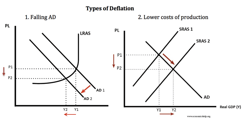
ps. See attached visual model of good vs bad deflation.

https://www.economicshelp.org/wp-content/uploads/2017/11/types-of-deflation-1.png

Model 1 (“Falling AD”) is a graph of bad deflation resulting from a sudden demand shock, usually the result of a banking crisis and contracting money supply. The quantity (x-axis) of demand represented by curve AD1 shifts left to lesser demand curve AD2. Thus the intersection with long-run aggregate supply curve LRAS moves down the price or y-axis from P1 to P2 resulting in lower prices.

Model 2 (“Lower costs of production”) is a graph of good deflation resulting from capital investment and higher productivity which raises output of goods and services per unit of labor. The quantity (x-axis) of aggregate supply represented by curve SRAS1 shifts right to greater supply curve SRAS2. Thus the intersection with aggregate demand curve AD moves down the price or y-axis from P1 to P2 resulting in a lower prices.

There is absolutely nothing wrong with Model 2 as it was the real-world norm during the spectacular growth periods of the Industrial Revolution and American Gilded Age. In fact good deflation would be the norm today were it not for central banks producing new money at a rate faster than the growth of goods and services in a deliberate policy of eternal price inflation.

In the “bad deflation” environment, government intervention has historically made things much worse. If the government forces prices back to P1 (price and wage floors such as those during the Great Depression) a gap or “surplus” in quantity appears between new demand curve AD2 and supply curve LRAS. That gap—follow dotted-line P1 between AD1 and AD2—in quantity applies to both goods and services and particularly labor. 

Hence as aggregate demand fell during the Great Depression and the government forced wages up to old price level P1, the supply of labor at LRAS/P1 exceeded the demand for labor at AD2/P2, and the surplus was manifested as double-digit unemployment for a decade that peaked above 25% in 1933.

Thursday, October 8, 2020

Wuhan Institute of Virology 2015 Paper: "We Created a Chimeric Virus... ...from Chinese horseshoe bats... ...in primary human airway cells and in vivo."

Click here to read the original Cautious Optimism Facebook post with comments 

1. Chimeric (adj): relating to or denoting a DNA molecule with sequences derived from two or more different organisms, formed by laboratory manipulation.

2. "…we built a chimeric virus encoding a novel, zoonotic CoV spike protein—from the RsSHC014-CoV sequence that was isolated from Chinese horseshoe bats... ...Using this approach, we characterized CoV infection mediated by the SHC014 spike protein in primary human airway cells and in vivo."

-Dr. Shi Zhengli, et al. (2015 research paper on Wuhan Institute of Virology bat coronavirus research)

Wuhan Institute of Virology bat coronavirus expert Shi Zhengli

4 MIN READ - The Cautious Optimism Correspondent for Left Coast Affairs and Other Inexplicable Phenomena thanks CO Nation regulars Don Deere, Ticiba Upe, and others for sending him down the investigatory road that led to the discovery of this 2015 scientific paper detailing bat coronavirus re-engineering experiments at the Wuhan Institute of Virology.

The Correspondent has extracted key passages from this open 2015 scientific paper (link and excerpts at end of column). The text reads somewhat technically, but with a little persistence one can clearly see what the joint Chinese-western team was trying to accomplish, including “batwoman” Shi Zhengli, China's top authority on bat coronaviruses.

In layman terms, they were concerned that one day a bat coronavirus might jump naturally to humans and create another 2003 SARS-like outbreak.

So to head off such an eventuality they decided to genetically alter a natural coronavirus from the horseshoe bat to enhance its ability to infect mammals via the ACE2 receptor and then test various antibody therapies on it to stockpile effective treatments in case such a future outbreak might occur.

They also tested the genetically altered coronaviruses on human lung tissue and were pleased with the results. The artificial coronavirus proved quite adept at penetrating lung tissue and replicating.

However some western scientists expressed concern that the risks of such experiments far outweighed any potential benefits should the chimeric virus “escape.” In other words, their risky research to head off a future outbreak might create the outbreak itself.

The Left Coast Correspondent is no fan of paranoid conspiracy theories that instantly circulate at the first onset of every crisis, but over time more and more circumstantial evidence has emerged providing a growing list of implausible coincidences.

Each single coincidence was already somewhat dubious on its own, but as more and more are added to the long chain of coincidences the shrinking probabilities relentlessly build a circumstantial case that Covid-19 was artificially conceived at the Wuhan Institute of Virology as a superefficient human infector for benign albeit unwise reasons.

In other words, once in a while a conspiracy theory turns out to have merit.

The unlikely chain of coincidences includes:

-The outbreak started in Wuhan, the same city where the experiments were conducted.

-The original Covid-19 coronavirus originates in a species of bat that lives 500 miles away from Wuhan.

-All cell phone voice and data traffic dropped to zero at the Wuhan Institute of Virology from October 7-24 of 2019, consistent with a shutdown if Chinese authorities suspected a leak.

-The Covid virus is superefficient at infecting humans, something unusual for viruses that have just made their first natural jump. Natural viruses typically need years/decades of mutations to perfect the process, but Covid-19 hit the ground blazing through the planet's human population effortlessly. By contrast the SARS and MERS coronaviruses quickly burned out because they couldn’t infect more humans easily enough.

-A Chinese virologist has defected to the United States claiming the Covid-19 coronavirus is chimeric and was engineered at the Wuhan Institute of Virology.

-Scientific papers still exist online confirming the reengineering of bat coronaviruses was taking place at the Wuhan Institute of Virology for the expressed purpose of making them highly infectious to mammals and human lung tissue.

-China’s “batwoman” Shi Zhengli has made public statements denying the Covid-19 virus is related to the viruses her team was working on at the WIV, her words and mouth movements obviously connected to puppet strings tugged by her ventriloquist: the Chinese Communist Party. Communist precedent exists with Soviet scientists we now know were ordered to lie to the world about the 1979 Sverdlovsk laboratory anthrax outbreak. 

-The Chinese government prohibited any WIV access to outside experts until finally providing NBC News a sanitized tour and controlled interview in August of 2020, more than eight months after the initial outbreak at Wuhan's Huanan Seafood Market.

-The Chinese government has hidden away WIV scientists and technicians, putting them out of reach from international experts and journalists. Only a few prepared statements and controlled interviews with state run Chinese media have been allowed, and what few western scientific inquiries are answered have been funneled through WIV Director General Wang Yanyi, an immunologist who has ascended to the Director General post through a combination of her scientific credentials, loyalty to the Communist Party, and political shrewdness adhering to official CCP narratives.

Yet the Chinese Communist government insists these are all coincidences and that the Covid outbreak is completely natural in origin.

Links to the paper and article about scientific dissent are included below as well as the key passages including multiple instances of the words “chimeric virus.”

==========

https://www.nature.com/articles/nm.3985

“The emergence of severe acute respiratory syndrome coronavirus (SARS-CoV) and Middle East respiratory syndrome (MERS)-CoV underscores the threat of cross-species transmission events leading to outbreaks in humans. Here we examine the disease potential of a SARS-like virus, SHC014-CoV, which is currently circulating in Chinese horseshoe bat populations1. Using the SARS-CoV reverse genetics system2, we generated and characterized a chimeric virus expressing the spike of bat coronavirus SHC014 in a mouse-adapted SARS-CoV backbone. The results indicate that group 2b viruses encoding the SHC014 spike in a wild-type backbone can efficiently use multiple orthologs of the SARS receptor human angiotensin converting enzyme II (ACE2), replicate efficiently in primary human airway cells and achieve in vitro titers equivalent to epidemic strains of SARS-CoV.”

“Evaluation of available SARS-based immune-therapeutic and prophylactic modalities revealed poor efficacy; both monoclonal antibody and vaccine approaches failed to neutralize and protect from infection with CoVs using the novel spike protein.”

"However, sequence data alone provides minimal insights to identify and prepare for future prepandemic viruses. Therefore, to examine the emergence potential (that is, the potential to infect humans) of circulating bat CoVs, we built a chimeric virus encoding a novel, zoonotic CoV spike protein—from the RsSHC014-CoV sequence that was isolated from Chinese horseshoe bats1—in the context of the SARS-CoV mouse-adapted backbone. The hybrid virus allowed us to evaluate the ability of the novel spike protein to cause disease independently of other necessary adaptive mutations in its natural backbone. Using this approach, we characterized CoV infection mediated by the SHC014 spike protein in primary human airway cells and in vivo, and tested the efficacy of available immune therapeutics against SHC014-CoV."

"...bat Ace2 sequence was based on that from Rhinolophus leschenaulti, and DBT cells expressing bat Ace2 were established as described previously8. Pseudotyping experiments were similar to those using an HIV-based pseudovirus, prepared as previously described10, and examined on HeLa cells (Wuhan Institute of Virology) that expressed ACE2 orthologs. HeLa cells were grown in minimal essential medium (MEM) (Gibco, CA) supplemented with 10% FCS (Gibco, CA) as previously described24. Growth curves in Vero E6, DBT, Calu-3 2B4 and primary human airway epithelial cells were performed as previously described."

https://www.nature.com/news/engineered-bat-virus-stirs-debate-over-risky-research-1.18787

"other virologists question whether the information gleaned from the experiment justifies the potential risk. Although the extent of any risk is difficult to assess, Simon Wain-Hobson, a virologist at the Pasteur Institute in Paris, points out that the researchers have created a novel virus that “grows remarkably well” in human cells. “If the virus escaped, nobody could predict the trajectory,” he says."

""The only impact of this work is the creation, in a lab, of a new, non-natural risk,” agrees Richard Ebright, a molecular biologist and biodefence expert at Rutgers University in Piscataway, New Jersey. Both Ebright and Wain-Hobson are long-standing critics of gain-of-function research."

Monday, September 28, 2020

Long Term Inflation or How Today’s Governments Will Never Pay Their National Debts Back Honestly

Click here to read the original Cautious Optimism Facebook post with comments 

6 MIN READ - The Cautious Optimism Correspondent for Economic Affairs and Other Egghead Stuff looks at the very real prospects for higher inflation over the long-term. Anyone interested in understanding more about the national debt may want to read on. 

The Economics Correspondent has written repeatedly he isn’t worried about this year’s Fed Covid QE fueling price hyperinflation. To read his past entries on short and mid-term inflation click the following links:

http://www.cautiouseconomics.com/2020/04/monetary-policy-12.html

http://www.cautiouseconomics.com/2020/09/monetary-policy-17.html

However long-term inflation is more concerning although again, not because of the Fed’s massive quantitative easing of 2020. Rather, the catalyst is more likely to be the exploding national debt.

I. THE STATE OF THE NATIONAL DEBT

Because the federal government has so far borrowed nearly $3 trillion to spend on Covid bailouts, unemployment, assistance to state and local governments, and direct payments to households, the public debt has exploded to $26.8 trillion as of this writing. Meanwhile GDP contracted heavily in the spring although it should bounce back somewhat as economies reopen.

Exploding debt and a shrinking or more slowly growing economy means a skyrocketing debt-to-GDP ratio, the number that really matters to economists and policymakers.

Before the crisis the debt-to-GDP ratio had held fairly steady slightly above 100% from Barack Obama’s departure right up to March of 2020.

However with the Covid crisis the math quickly changed. Now the debt is $26.8 trillion and GDP, while erratic, is down somewhere closer to $20 trillion (it’s hard to say for certain since we’ve only gotten one full quarter’s GDP during the Covid pandemic). In the blink of an eye the debt-to-GDP ratio has risen from 107% to somewhere around 135-140%, eclipsing the all-time record of 120% set at the end of World War II.

As the debt-to-GDP ratio soared through the summer, the Correspondent worried more about inflation in the long term, but not due to some sort of “accident” resulting from a stimulus program like QE. Rather the concern was deliberate Fed policy to dilute the real value of the concerning national debt.

Some readers may already be aware of this longstanding trick by governments and central banks, but for those who aren’t just keep on reading. This might be one of the most informative and depressing things you’ll learn this month about fiscal and monetary policy.

II. IN THE AGE OF FIAT MONEY NATIONAL GOVERNMENTS NEVER HAVE TO PAY DOWN THEIR DEBTS

Governments have shown repeatedly over history that they almost never solve their debt problems through honest accounting—ie. raising taxes or preferably cutting spending. Since both of those policies are unpopular with the public and tend to get monarchs deposed or politicians thrown out of office, governments have usually resorted to inflation to lower the real value of the debt.

The trick goes all the way back to Dionysius of Syracuse (ancient Greece: 4th century BC) when he restamped all drachma coins at double their original denomination to solve his own overborrowing problems.

Or to the Roman Emperor Diocletian who helped slowly remove 98% of the silver content from the Denarius coin, using the siphoned silver to create more coins and inflate away the value of the imperial debt.

Even in the 20th century “a little more inflation” is how the U.S. government managed to whittle a debt-to-GDP ratio of 120% after World War II down to 30% by the 1970's. Washington ran deficits in 27 of the 35 years between 1945 and 1980, yet the debt-to-GDP ratio still fell by three-quarters over that time.

How? By both applying economic growth (real GDP growth) and inflating away the dollar's purchasing power from $1 to 24 cents over those 35 years, Congress never had to pay back 1945’s $250 billion nominal public debt honestly.

Back in 1945 a national debt of $250 billion was a staggering, unthinkable number. Almost no one thought such a huge sum could ever be repaid at a time when U.S. GDP was only $228 billon. But by 1980 US GDP had risen twelvefold to $2.85 trillion in nominal terms, so a $250 billion debt didn’t seem so bad by then.

But economic output had not increased twelvefold, only tripled, the result of population growth and higher productivity.

To upsize a tripling economy to twelve times its original size in nominal terms required price inflation which was devotedly provided by our central bank: the Federal Reserve. And hence what was considered an insurmountable national debt in 1945 became quite manageable by 1980.

Fast-forward to today and the debt-to-GDP ratio has grown to record heights once more in 2020. Hence the Correspondent believes the Fed will help out the very Congress that grants its monopoly power over base money by ratcheting up inflation over many years yet again—all to effectively repudiate its debt obligations through sleight of hand.

III. THE FED MAKES HIGHER INFLATION OFFICIAL

Well this is all what the Correspondent was thinking this summer. Unfortunately the Fed beat me to writing about it.

https://www.cnbc.com/2020/08/27/powell-announces-new-fed-approach-to-inflation-that-could-keep-rates-lower-for-longer.html

Late last month the Federal Reserve made a historic policy change announcing it was abandoning its long held “price stability” target of 2% annual inflation for instead an “average inflation target” of 2%.

Since official inflation has run closer to 1% for the last twelve years, the Fed argued it should run inflation higher than 2% in coming years in order to raise the “average” closer to 2%.

The new policy is inconsistent with its previous rationale for targeting 2% year-to-year, and the Fed’s policy statement included quite a bit of mental gymnastics to explain why higher inflation going forward to offset lower inflation more than a decade past is somehow a good thing.

But the real, unspoken reason is clear: The national debt is out of control—at levels that now even the Fed is worried about—and policymakers are finally acting to do something about it.

The solution will be higher inflation.

Just a little math to demonstrate the power of growth and inflation to reduce the federal government’s debt liability is illustrative:

If a $20 trillion economy grows in real terms by 2% a year, in 15 years real output will be $27 trillion (1.02^15 x $20T = $26.9T).

Then if the Fed also creates enough new money to produce 1.5% annual inflation the $27 trillion real economy grows to $34 trillion in nominal terms without a single extra widget being produced. It’s all just higher prices.

Voila, with no reduction in our government’s debt position of $26.8 trillion, the debt-to GDP ratio falls from 134% to 79% in 15 years--all through growth and inflation.

However if the Fed produces higher inflation—say, 3% a year for 15 years—the $27 trillion real economy grows to an even higher $42 trillion in nominal terms. Again, not a single extra widget is produced in the real economy, yet the debt-to-GDP ratio is more than halved from 134% to 64%—1980's levels—without the government paying down a penny of the national debt.

And history shows Congress and future presidents won’t be content to leave it at that. The Economics Correspondent predicts—in fact guarantees—they’ll take the falling debt-to-GDP ratio as license to find new ways to run even higher deficits so that 15 years from now the national debt won’t stabilize at $26.8 trillion but rather rise to $46.1 trillion or higher to reach a “sustainable” debt-to-GDP ratio of 100%.

This free lunch is made possible by the sleight of hand every government in the world uses to finance unlimited deficit spending. Keep borrowing and spending year after year, so long as growth and inflation keep bailing the Treasury out down the road.

Even President Trump was relying on it when he ran $800 billion and $900 billion deficits in the first three years of his administration. His Treasury Secretary Steve Mnuchin said repeatedly that deficits wouldn’t be much concern so long as the economy could achieve 3% annual GDP growth. A $20 trillion economy growing 3% a year in real terms and running 2% inflation can run a $1 trillion deficit with absolutely no change in the debt-to-GDP ratio. And every president before him going back to FDR played the same game.

 IV. NO FREE LUNCH, WE ALL PAY

As Milton Friedman said, there really is no such thing as a free lunch. With a hypothetical future inflation of 3% Americans and foreigners holding dollars will be the ones who pay for this seemingly magical debt payback by losing half the purchasing power of their money every 23 years, but they'll be told by the newspapers and academics that the inflation is good for them and that it “promotes full employment.”

In fact higher inflation is only a good thing for debt addicts and governments who want to spend beyond their means forever without having to pay back their accumulated debts honestly.

And as mentioned before this trick goes back to ancient Greece, but Adam Smith also condemned it famously and eloquently in his famous 1776 book “The Wealth of Nations.”

In Smith’s time most governments didn’t have the luxury of fiat money and monopoly central banks with computers that created bank reserves out of thin air. To expand the money supply and inflate prices they had to reduce the precious metal content in coins or devalue the currency unit’s definition into a lesser weight of metal.

But the fundamental principle is no different in 2020. As Smith noted nearly 250 years ago:

 "When national debts have once been accumulated to a certain degree there is scarce, I believe, a single instance of their having been fairly and completely paid..."

"…The raising of the denomination of the coin has been the most usual expedient by which a real public bankruptcy has been disguised under the appearance of a pretended payment. The honour of a state is surely very poorly provided for, when, in order to cover the disgrace of a real bankruptcy, it has recourse to a juggling trick of this kind, so easily seen through, and at the same time so extremely pernicious."

-The Wealth of Nations (Book V, Chapter III)